
Разработка CS-Cart
Alt-team предоставляет широкий спектр услуг по индивидуальной разработке CS-Cart.
Разработка маркетплейса на CS-Cart
Настройка CS-Cart
Разработка интернет-магазина на CS-Cart
Интеграция платежных и доставочных сервисов CS-Cart
Разработка дополнений для CS-Cart
Почему люди выбирают Alt-team?
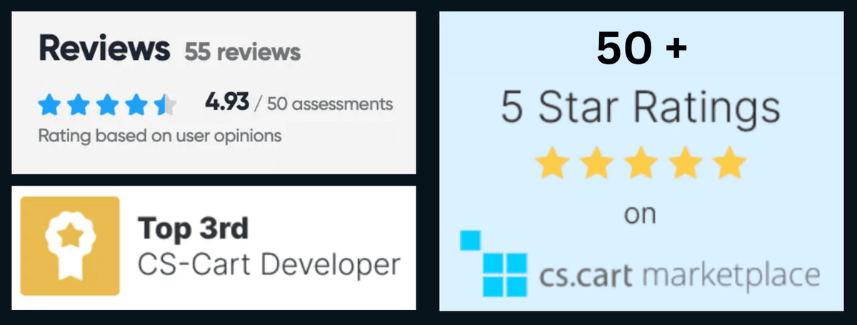
Нанимайте опытных разработчиков CS-Cart
Мы рады предложить вам полный перечень наших услуг по разработке CS-Cart:

Наша компания имеет большой опыт в разработке таких проектов и с удовольствием поможет вам создать интернет-магазин с нуля в соответствии с вашими требованиями. В результате вы получите готовое решение для электронной коммерции, чтобы начать свой бизнес.

Мы можем разработать любую функциональность для магазина CS-Cart, которая не предоставляется по умолчанию. Мы уже выполнили более 1000 малых и крупных проектов по индивидуальной разработке и будем рады внести наш опыт в вашу идею.

Если у вас есть готовый макет дизайна, но вы испытываете проблемы с его интеграцией в ваш сайт на основе CS-Cart, мы готовы помочь вам. Обладая обширным опытом интеграции дизайна CS-Cart, мы обеспечиваем комплексный подход к процессу интеграции на всех этапах реализации проекта.

Наша команда рада предложить интеграцию платежных модулей в CS-Cart, включая интеграцию дополнительных услуг, предоставляемых платежной стороной, и услуги по обновлению платежей.

Мы предлагаем следующие услуги: базовая интеграция модуля доставки; дополнительные услуги, такие как генерация печатных этикеток для отправки и т.д.

Функциональность CS-Cart позволяет выполнять плавную интеграцию с сторонними приложениями. Мы успешно реализовали множество проектов по интеграции с сторонними системами и рады предоставить эту услугу.

Мы предлагаем вам установку программного обеспечения CS-Cart на хостинг. После установки вы получите полностью функционирующий магазин, настроенный PHP, MySQL и веб-сервер.

Мы предоставляем услуги по переносу, такие как перенос всего магазина с одного сервера на другой или просто перенос базы данных с одного сервера на другой.

Обновление до последней версии CS-Cart может стать реальной проблемой, если у вас много сторонних модификаций и изменений в основных файлах вашего магазина. Нужна помощь с обновлением? Мы готовы помочь вам.

Разработчики Alt-team могут увеличить скорость загрузки вашего сайта и сделать процесс оптимизации онлайн-магазина CS-Cart быстрым и эффективным. Имея большой опыт в этой области, мы готовы к любой сложной работе.
Alt-team предоставляет клиентам следующие гарантии:
высококачественный код в соответствии со всеми вашими требованиями,
4 месяца бесплатного исправления ошибок.
Стоимость разработки CS-Cart:
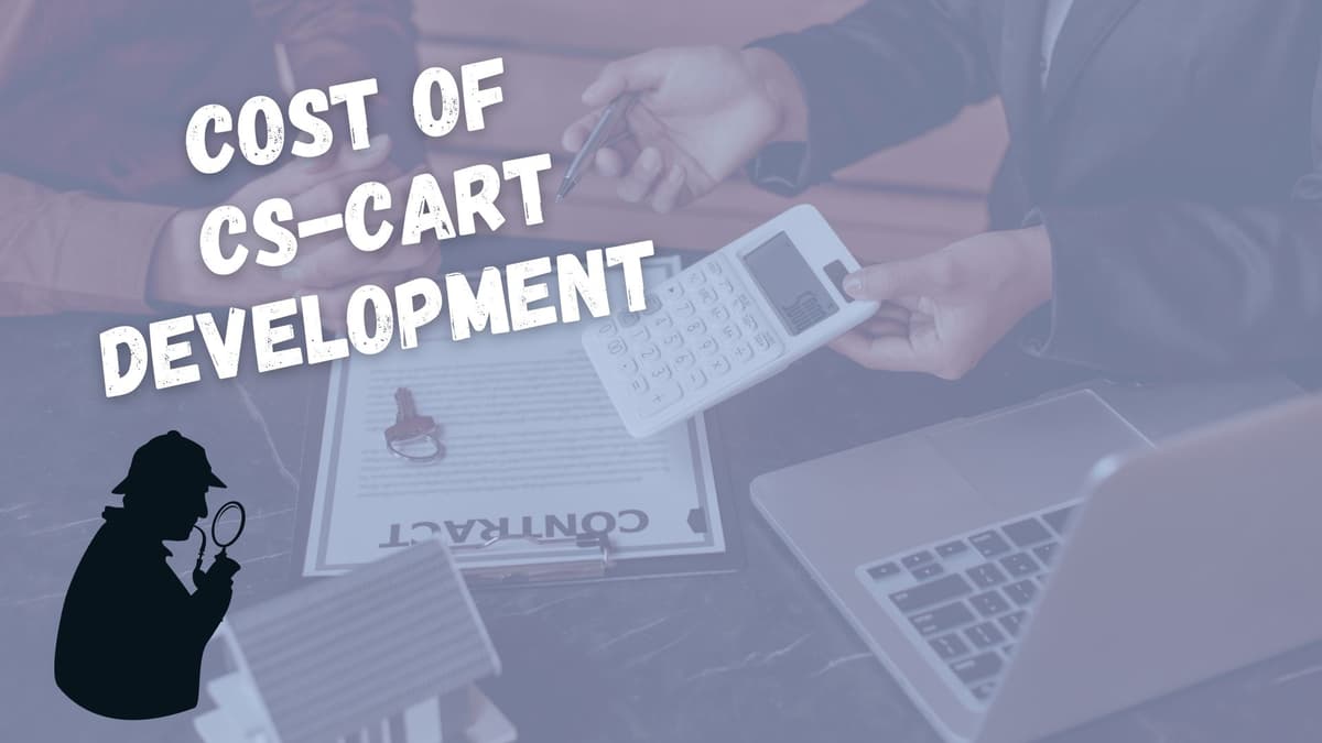
Каждая модификация CS-Cart оценивается индивидуально на основе ваших конкретных потребностей, технических спецификаций и сложности задачи.
Примерные расценки на разработку CS-Cart
Настройка CS-Cart - от 280 долларов США
Кастомизация темы CS-Cart - от 300 долларов США
Интеграция платежей/доставки CS-Cart - от 400 долларов США
ПРИМЕЧАНИЕ
На анализ всех ссылок и технических описаний, которые вы нам отправляете для оценки, у нас уходит более 24 часов. Мы делаем все возможное, чтобы ответить вам в тот же или на следующий день.
Разработка маркетплейса на CS-Cart

Alt-team создает очень быстрые и супер-безопасные маркетплейсы на основе CS-Cart MultiVendor.
Преобразуйте свой магазин CS-Cart в функциональный маркетплейс, подобный Amazon, Etsy, eBay и другим. Вы можете получать прибыль от продаж множества продуктов различных продавцов.
Типы маркетплейсов на CS-Cart, которые мы создаем
Это бизнес-модель, в которой компании продают свою продукцию непосредственно клиентам.
Пример из нашего портфолио: Romanian marketplace
C2B - это модель, при которой потребители представляют ценность бизнесу, а не наоборот, как в модели B2C.
Примеры: реферальные программы, платные отзывы.
B2B маркетплейс - это цифровая платформа, которая позволяет компаниям связываться с другими организациями и вести бизнес в одном месте. Как и традиционная платформа B2C, B2B маркетплейсы - это места, где компании покупают и продают продукцию, обычно оптом.
Пример из нашего портфолио: Industrial Marketplace
C2C, или потребитель-к-потребителю, - это бизнес-стратегия, которая облегчает обмен товарами или услугами между клиентами. Концепция бизнеса, продвигающая торговлю между частными лицами, известна как "потребитель к потребителю" или C2C.
Пример из нашего портфолио: handmade products shop
CS-Cart кастомизация
Alt-team специализируется на настройке CS-Cart, предлагая индивидуальные решения для удовлетворения уникальных потребностей вашего бизнеса:
Улучшение дизайна
Оптимизация функциональности
Беспроблемная интеграция
Повышение производительности
Постоянная поддержка
Выбирайте Alt-team для профессионального подхода, индивидуальных решений и своевременной доставки. Давайте вместе поднимем ваш бизнес на новый уровень успеха в электронной коммерции!
Разработка интернет-магазина на CS-Cart
CS-Cart Store Builder: Ваш путь к успеху в электронной коммерции
Компания Alt-team является официальным реселлером и партнером CS-Cart.
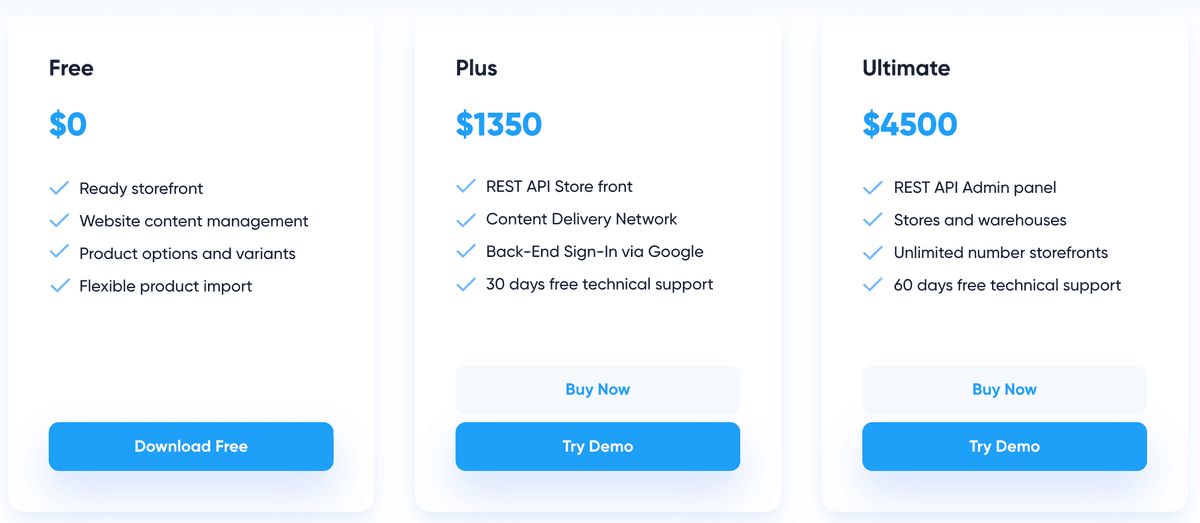
Тарифные планы CS-Cart Store Builder
CS-Cart Store Builder Free - $0
CS-Cart Store Builder Plus - $1350
CS-Cart Store Builder Ultimate - $4500
Мы предлагаем дополнительные готовые модули бесплатно и скидку на наши услуги по настройке при покупке лицензий и подписок CS-Cart у Alt-team.
Часто задаваемые вопросы о CS-Cart
CS-Cart — это программное обеспечение для электронной коммерции, предназначенное для создания и управления интернет-магазинами.
Оно предоставляет полный набор инструментов и функций для настройки интернет-магазина, управления продуктами, обработки заказов, обработки платежей и многого другого.
Существует бесплатный тарифный план для использования CS-Cart. Основные функции бесплатной версии CS-Cart включают:
Готовую витрину магазина
Управление содержимым сайта
Опции и варианты продуктов
Гибкий импорт продуктов
Однако, с бесплатной версией CS-Cart невозможно создать полнофункциональный интернет-магазин. В конечном итоге вам может потребоваться покупка дополнительных функций для вашего бесплатного магазина CS-Cart. Бесплатная версия предназначена для того, чтобы вы могли попробовать этот магазин и решить, подходит ли он для вашего онлайн-бизнеса. Впоследствии вы, скорее всего, приобретете стандартную или даже расширенную версию CS-Cart.
Да, CS-Cart является легальной платформой для электронной коммерции. Она широко используется бизнесом для создания и управления интернет-магазинами.
CS-Cart предлагает бизнесу:
Полный набор функций для управления интернет-магазинами.
Возможности для кастомизации брендинга.
Встроенные инструменты для выполнения основных задач электронной коммерции.
Удобный интерфейс.
Масштабируемость для бизнеса любого размера.
Службы поддержки для оказания помощи.
Сан Диего
CS-Cart — это программное обеспечение для маркетплейсов, зарегистрированное в Патентном ведомстве США.
Главный офис компании находится в Сан-Диего. Команда работает из различных мест по всему миру, включая США, Грузию, Черногорию, Казахстан, Кипр и другие страны Европы и Азии.
Стандартные версии CS-Cart используют язык программирования PHP и шаблонный движок Smarty.
CS-Cart Multi-Vendor Enterprise использует Laravel для бэкенда. Он поддерживает PostgreSQL и использует GraphQL API для взаимодействия с фронтендом.
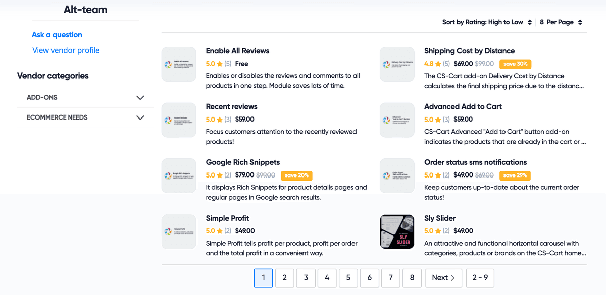
Разработка модулей для CS-Cart
Истории успеха от наших клиентов CS-Cart

Marketplace
metalsnet.comМаркетплейс MetalsNet предназначен для торговли металлоизделиями в США.
Главные особенности сайта MetalsNet:
Это маркетплейс
Работает по всей Америке
Простой и удобный веб-дизайн
Расширенная система котировок
Конечный покупатель получает несколько предложений от местных поставщиков металла и выбирает лучшее предложение.
Что выполнила компания Alt-team:
Разработка веб-дизайна
Расширенная система котировок для фронтенда и бэкенда
Мы разработали три различных типа оформления заказов с пользовательскими полями и функционалом:
Клиент создает запрос на котировку;
Клиент соглашается с предложением поставщика;
Поставщик принимает запрос клиента
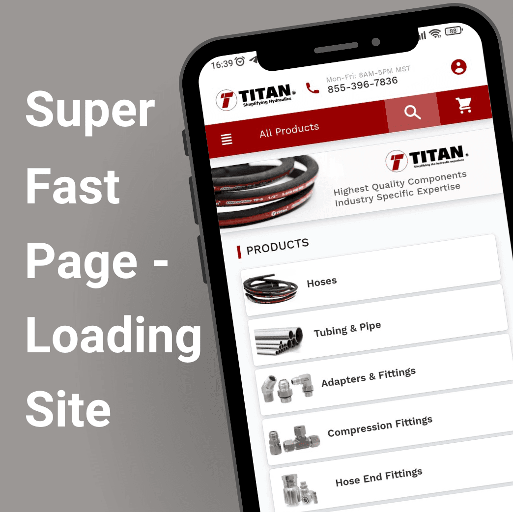
E-commerce store
titanfittings.comГлавные особенности интернет-магазина:
Миграция с Volusion на CS-Cart
2,000 категорий
Более 20,000 товаров
Мгновенный поиск по магазину — менее 3 мс
Очень быстро загружаемый сайт
Простой и удобный дизайн
> 90
Google PageSpeed
> 20 000
Количество продуктов
~3 мс
Время поиска
Clients tell about us
Большое спасибо за усилия. Ребята, спасибо вам огромное! Это был долгий путь, но мне нравится, как все получилось.

Alt-team — лучшая команда. Здесь работают только квалифицированные программисты. Я много лет работаю с Alt-team, и они помогают мне с моим маркетплейсом.

Alt-team – это супер надежный партнер. Быстрая оценка, своевременная доставка. Общение четкое и целенаправленное. Мы очень довольны нашим сотрудничеством. Спасибо!

В очередной раз команда Alt-team оказала отличную помощь в решении проблемы, с которой я столкнулся в своем магазине. У меня был сторонний модуль, конфликтующий с основным модулем. Я попросил Alt-team посмотреть, смогут ли они найти и исправить все ошибки, они сделали все быстро и эффективно и все время держали меня в курсе. Молодцы, спасибо.

Компания Alt-team предлагает CS-Cart интеграции:

После того как дизайнер завершит создание уникальных макетов для интернет-магазина, вам потребуется услуга интеграции дизайна CS-Cart, чтобы перенести все созданные концепции в HTML-код. Интеграторы Alt-team могут предоставить вам такую услугу.
Хотя решение CS-Cart уже интегрировано с более чем 50 популярными платежными системами, иногда требуется добавить новые методы оплаты в интернет-магазин. Мы с радостью поможем вам с этой задачей.

CS-Cart предлагает самые популярные службы доставки в мире: Fedex, UPS, USPS, DHL, Australia / Canada / Swiss Post и Temando. Но бывают случаи, когда требуется использовать другие службы доставки из-за их низких цен, удобства определенных служб доставки в вашей стране или торговой зоне. Мы можем интегрировать любые службы доставки с системой CS-Cart.
Несмотря на то, что решение CS-Cart по умолчанию интегрировано с широким спектром сторонних систем, могут возникнуть ситуации, когда вам не хватает определенных сервисов. Согласно нашему опыту, многие сторонние сервисы находят свою нишу на рынке электронной коммерции и становятся популярными и востребованными в определенных областях каждый год. Мы можем решить эту проблему для вас.
Contact Us
Our email is manager@alt-team.com
Please, do not hesitate to contact us via e-mail or use the form below if you need a quote for your E-commerce project or have any questions about our products or services. We will be glad to answer you in a short time.